Increasing user retention by 7% with a new onboarding
Talent seekers (one segment of our users) were taking too long to engage with their job openings after posting them, leading to a high dropout rate in Torre.
We identified that the main cause was the complexity and unclear descriptions of some features on the platform, which were also difficult to understand for new users.
To address this, I developed a self-guided product tour that briefly explained the most important features of the platform. This effort resulted in a 7% increase in user retention, a 14% improvement in positive user feedback, and a 37% completion rate for the tour.
Maybe not the best numbers, but I think you'll find the overall design process insightful.
Company:
Torre
Role:
Product Designer
Team involved:
CEO, Product Manager, UX Researchers, Data Analyst, Tech Lead
Tools used:
Figma, Notion, Metabase
About Torre and the sections for talent seekers
Torre is a two-sided platform that connects job seekers with opportunities and helps talent seekers find ideal candidates by analyzing and matching skills and preferences. For talent seekers, these three sections are especially important:
The job post: Your classic job board view, where talent seekers provide all the necessary details about the opportunity, including responsibilities, compensation, location, required skills, contract type, and so on.
The pipeline of candidates: A Kanban-style board that shows the recruitment flow. It allows talent seekers to review and move around candidate cards as they move along the different recruitment stages, like 'Interviewing' or 'Hired'.
The candidate's profile: A compect view of the candidate's information, including skills, interests, professional experience, compensation preferences, reputation, and how well they match the role.
Let me give you a quick 30 second tour of these three views.
Please ignore any weird candidate name, since this is a test job opening 😬
Houston, we have a problem…
During one of our weekly metrics review with Product team, we identified two worrying metrics related to talent seeker engagement:
Activation time was too long. This meant many talent seekers weren't interacting with their job openings after posting them, meaning no distribution or reviewing candidates.
Drop-off rate was too high. Many talent seekers weren’t posting a second job after they posted their first. In other words, users were churning.
This meant we were losing users early and struggling to retain them long enough to monetize. And for any startup, that's a big problem. Our goal now was to understand why was this happening, and come up with a solution.
How did we tackle this problem?
Step 1: Research
The UX Research team interviewed several talent seekers (TS), including active, retained and recently acquired ones, to better understand their challenges when using Torre. They found the following:
Only 30% of TS were able to hire someone through Torre’s platform.
TS felt frustrated by being asked for too much information, particularly when posting a job.
TS felt that Torre required too much time investment, especially while facing tight deadlines to hire.
TS reported confusion around several features and concepts.
Together with the Product Manager, we reviewed this analysis and thought:
The first issue could be a consequence of poor user retention, as hiring is rarely a quick process.
Issues two to four had a potentially strong correlation with problem we identified, so we decided to tackle them.
After brainstorming with members from the Operations and Engineering teams, our overall feeling was that most talent seekers weren't clearly understanding why Torre asked so much information and how its features could help them be more efficient in their recruitment process.
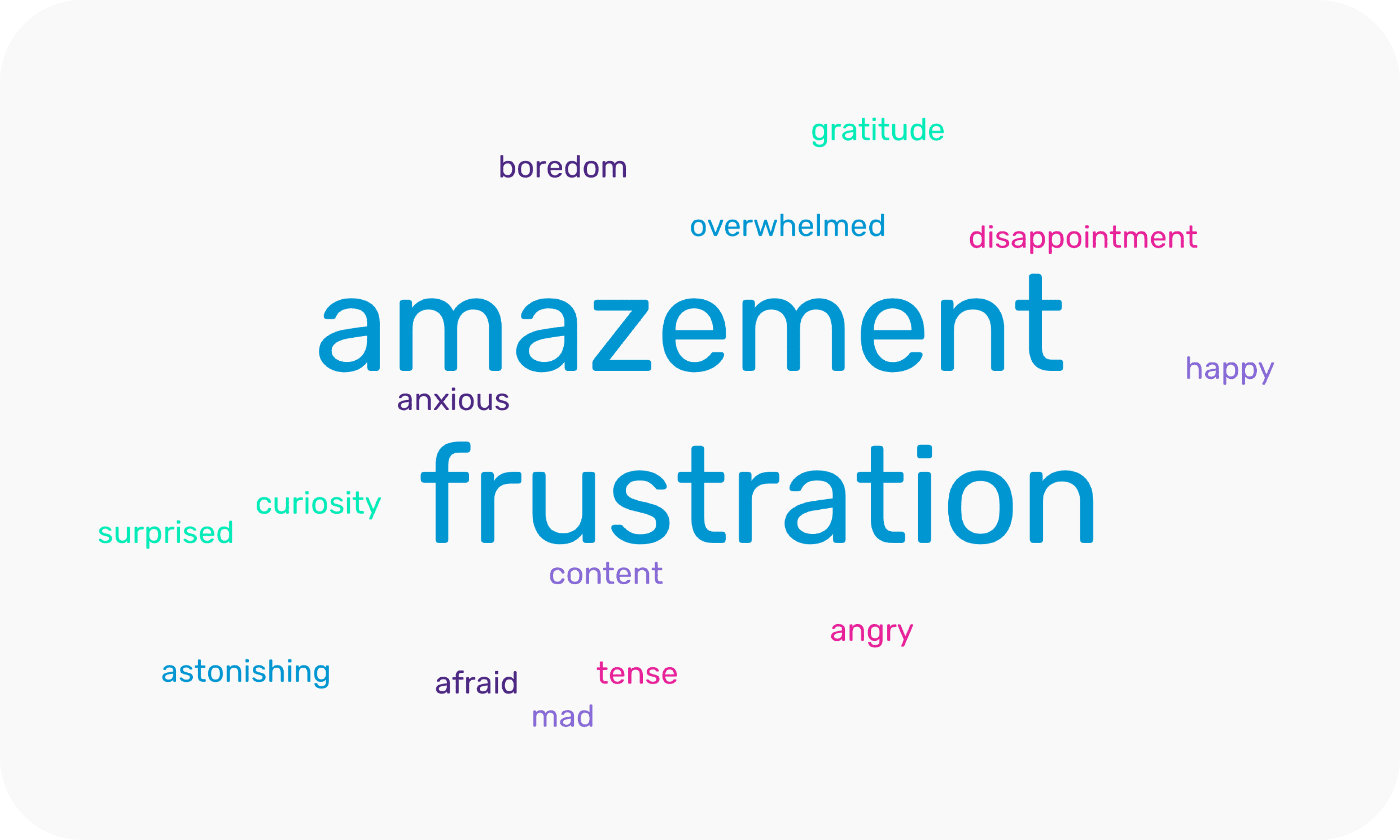
The most common emotions from active users.

The most common emotions from recently aquired users.
Step 2: Getting inspired (by other platforms)
We realized that we needed to improve how we explained our different features to our users, especially talent seekers. Getting them familiar with our platform. An onboarding? Yes, an onboarding!
But it couldn't be manual, because we didn't had enough resources to handle all and we didn't want to throw more work to our Operations team. So we aimed for something scalable, an onboarding built directly into the platform.
So with that constraint in mind, I analyzed how other complex platforms onboarded new users and 'got inspired'. Some examples included knowledge libraries, gamified checklists or to-do lists, and self-guided product tours.

I brought these ideas to my Product Manager and CEO to discuss and review which would be the best proposal. Finally, we agreed to move forward with a self-guided product tour with hotspots because:
It could be implemented faster than a knowledge base.
It allowed us flexibility as steps could be easily added, edited or removed to update the tour's experience.
We could ensure users to interact with it, unlike a checklist or knowledge base which could be easily ignored or not found.
It allowed us to track at which step talent seekers left the tour and analyze its engagement.
It allowed me to implement it with a third-party provider because we didn't have engineerings available at that moment (plot twist incoming on Step 4).
Step 3: Hypothesis and defining metrics
Our hypothesis was that adding a self-guided tour for the platform's main flows would help talent seekers better understand and engage with its functionalities. This should be reflected positively on the two key metrics we had issues with:
Activation time for talent seekers (in hours) — how long it took for talent seekers to interact with their job after posting it.
Talent seeker retention (%) — how many talent seeker returned to post a second job after posting their first.
Other secondary metrics we though were important to analyze the effort's impact were:
Overall product tour completion (%) — To see how many users who started the tour completed it.
Experience feedback from talent seeker (Net Promoter Score)
Step 4: Analyzing alternatives
As I mentioned before, due to engineering constraints, the initial idea was to have a third-party provider implement the self-guided product tour. I researched and compared several providers in terms of features and pricing to propose the best solution.
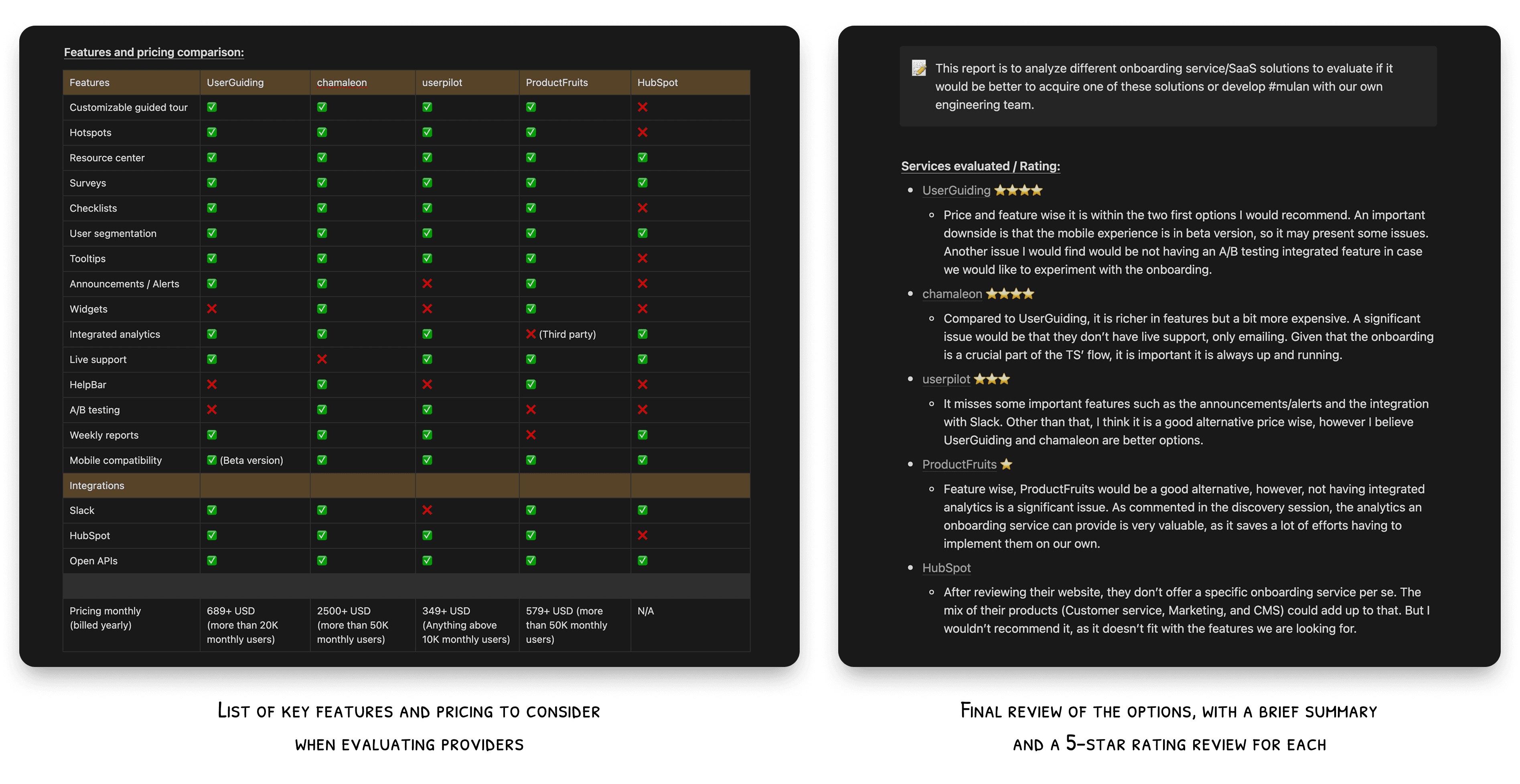
After comparing providers we decided to do a demo with Chamaleon. However, branding constraints and a surprisingly quick PoC (proof of concept) developed by one of our engineers made us realize we had made a mistake.
So, we took a U-turn and developed the product tour in-house. This approach allowed us to implement it faster and with a design that was fully aligned with our design system.
This hiccup delayed the release by about two to three days.
POC for the 'Posting a job' flow
POC for the 'Reviewing a pipeline of candidates' and 'Reviewing a candidate's profile' flows.
Step 5: Design, specification, and deployment
Finally, I designed and handed off the design and specs for all the hotspots of the product tour for the three most important flows for talent seekers:
Posting a job
Reviewing a pipeline of candidates
Reviewing a candidate's profile
Given that the tour relied on widely-used and proven UX patterns from top platforms, I argued that a usability test was unnecessary. This also meant we could recover the days lost from the third-party test. Both the Product Manager and the CEO agreed.
However, after development, I conducted a thorough quality assurance process with the engineering team in a feature-flag environment to ensure:
Smooth transitions between steps
Accurate positioning of the hotspots
Correct behavior when pausing, restarting, or ending a product tour in each flow
Running a QA session with my Tech Lead and the engineering team, looking for bugs throughout the product tour experience.
See if you can find the same bugs as we did, there are six in total. 🐛
Key takeaways and learnings
The effort was released in September 2023. Within the first month of deploying the self-guided product tour, we analyzed the metrics defined in our hypothesis with the data analytics team. The results were:
The activation time for talent seekers remained too variable month-over-month to attribute changes directly to this effort.
Talent seeker retention increased by 7%, measured by whether users returned to the platform to post a second job.
The overall product tour completion rate was 37%.
The positive experience feedback from talent seekers improved by 14%.
Based on these results, we decided to keep the self-guided product tour, and moving forward, our focus will be on increasing its completion rate.
Some personal notes:
Remember to keep all close team members updated about your work. The PoC was developed by one of the engineers in my squad when he became aware of the effort. My mistake was only aligning and asking for feedback for the Tech Lead of that squad.
Due to constraints, like a tight deadline, 'genius design' can be applied sometimes, but it isn't ideal.

⚠️ Update (April 2025)
The product tour was updated under a new effort, to remove some steps and include new ones in order to increase its completion rate and highlight new relevant aspects of the platform. The tour is currently being tested under a feature flag and you will be able to try it yourself in the following weeks.